

The reason people enjoy the NBA All-Star weekend extends way beyond the game. From Slam Dunk contests and to just honoring the top players in the league and all the entertainment, it has it all. But there is also the interesting part of how they look in this year’s All-Star jerseys.
Watch What’s Trending Now!
Over the years, some of them have really left an impact and made it to the best column of the list. And there are some that ended up on the opposite column, a complete abomination. Let’s take a look at both sides.
Worst NBA All-Star Jerseys
Phoenix, 1995
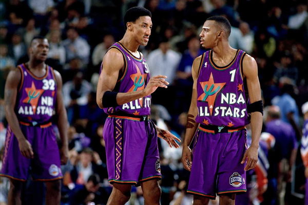
Who thought that making some of the greatest basketball players suit up in a purple jersey with a gigantic asymmetrical star that also had a cactus drawn inside it in the mid-1990s was a good idea?
It’s nice that the NBA wanted to somehow depict the city in which the game was being held. However, this random cactus surrounded by tiny weird stars just didn’t work for anyone.
Los Angeles, 2004
First of all, the color scheme was is so basic in this one. It’s as if they couldn’t think beyond the – Red, blue, and white. Moreover, the ‘East’ and ‘West’ sewed diagonally right in front of the jersey looks nothing less than amateur.
Thankfully, the talented 2004 Draft class that had Chris Bosh, Carmelo Anthony, LeBron James, and Dwyane Wade were all busy with the Rookie challenge game and were saved from wearing these.
New Orleans, 2008
The real question is that what is even right with these jerseys? Whether it’s the ornate western cursive font along with the gold and silver backs, it screams disaster.
In fact, these two-toned jerseys made the viewers confused and couldn’t always tell which player was which. This was just too over the top and needed to be taken down a notch.
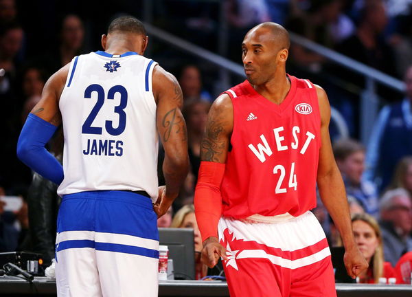
New York, 2015

Getty
NEW YORK, NY – FEBRUARY 15: John Wall #2 of the Washington Wizards and the Eastern Conference talks with Carmelo Anthony #7 of the New York Knicks and the Eastern Conference Kyle Lowry #7 of the Toronto Raptors and the Eastern Conference during the 2015 NBA All-Star Game at Madison Square Garden on February 15, 2015 in New York City. NOTE TO USER: User expressly acknowledges and agrees that, by downloading and/or using this photograph, user is consenting to the terms and conditions of the Getty Images License Agreement. (Photo by Elsa/Getty Images)
Although these jerseys were bashed for being too simple, it seems like their minimalist look is the one good thing about them. However, the overkill was adding both the first and last names of players at the back.
It would have been more creative and fun to have nicknames instead. But adding the first and last name behind uniforms of some of the popular names in the NBA was just foolish.
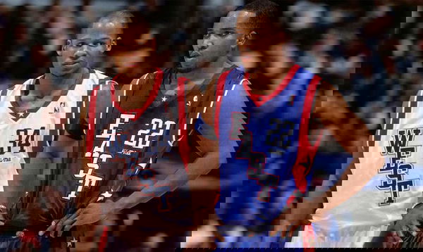
New Orleans, 2017
USA Today via Reuters
Feb 19, 2017; New Orleans, LA, USA; Western Conference forward Kevin Durant of the Golden State Warriors (35), Eastern Conference forward Kyrie Irving of the Cleveland Cavaliers (2) and Western Conference guard Stephen Curry of the Golden State Warriors (30) talk in the 2017 NBA All-Star Game at Smoothie King Center. Mandatory Credit: Bob Donnan-USA TODAY Sports
Once again, New Orleans jerseys have found their way here. It seems like almost no thought or effort went into designing these, but there may be a reason for it.
This year’s All-Star Game was supposed to be held in Charlotte instead. Although some last-minute changes had to be made and so, the event was shifted to take place in New Orleans instead. Nevertheless, no excuses for making something like this.
Read also- Giannis Antetokounmpo Breaks a 53-YO NBA All-Star Record with a Rare Feat in ASG 2021
Best NBA All-Star Jerseys
Houston, 1989
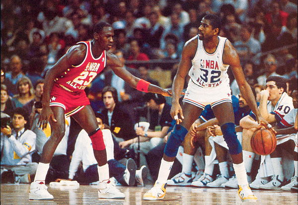
These have such a clean and classy look and the white jersey reminds us of the Team USA uniform. In fact, the same kind of design was used in 2003 with a few tweaks here and there. All this made everyone realize that the red and white combination looks quite good.
Also, Michael Jordan wearing this and once again in 2003 just adds to its charm. In fact, even Isiah Thomas played with Jordan back then.
Atlanta, 2003
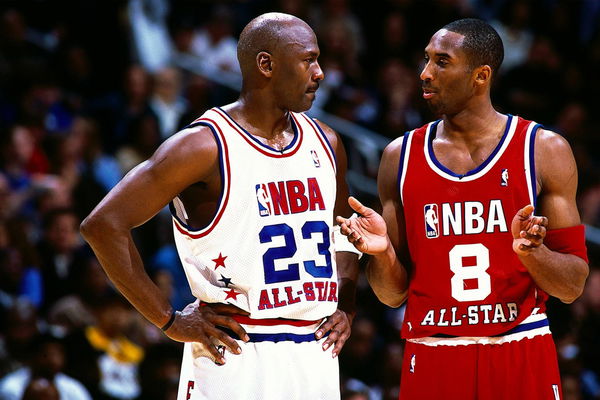
As mentioned above, nothing beats jerseys that looked like the ones in 1989. This 2003 Jersey was just a little baggier than the older one and modernized to fit the current trends.
This year was special because not only was this Jordan’s last appearance in an All-Star game, it was also a Kobe Bryant vs MJ moment which has so much significance.
Las Vegas, 2007
Nothing depicts Las Vegas like the font used on the front of these jerseys. This is exactly the way all neon signs in the city will look and is one of the most unique designs of all.
Orlando, 2012
Contrary to popular opinion that believes this jersey seems like going back in the 1980s, there is something about the gradient color scheme that is very catchy in this.
Neither is it too fancy nor is it too simple, as if no work has been put in to make them. The red, blue, gold, and silver have been put well across with each other.
Toronto, 2016
Not at all flashy, but still some amount of pizazz has landed this jersey in this column. The ‘East’ and ‘West’ in block letters on the front look classic and the best part about it is that the names are written on the lower back, below the jersey number, instead of it being spread out across the shoulder blades.
Which one do you think should have made it to either of the list?
Read also- NBA All-Star: Best Friends Chris Paul and LeBron James Break Assists Records Together
