
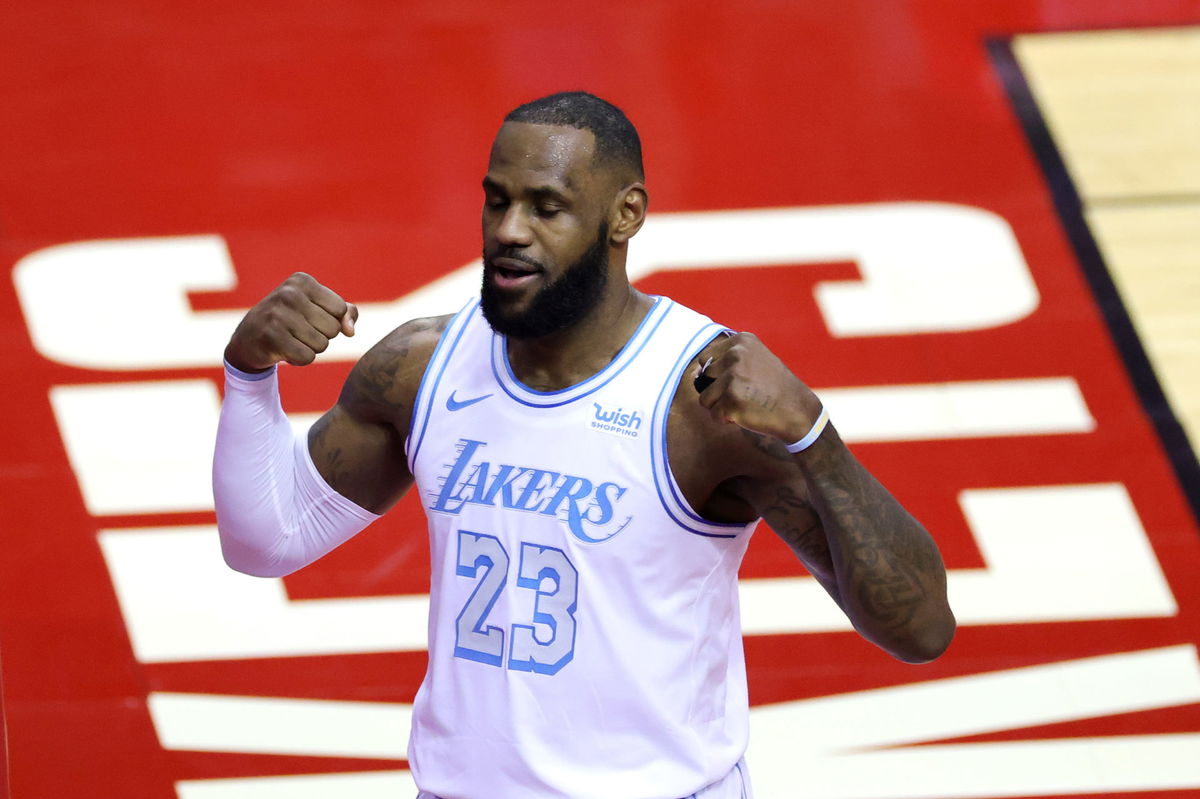
USA Today via Reuters
Jan 10, 2021; Houston, Texas, USA; LeBron James #23 of the Los Angeles Lakers reacts during the first quarter of a game against the Houston Rockets at Toyota Center on January 10, 2021 in Houston, Texas. Mandatory Credit: Carmen Mandato/Pool Photo-USA TODAY Sports
USA Today via Reuters
Jan 10, 2021; Houston, Texas, USA; LeBron James #23 of the Los Angeles Lakers reacts during the first quarter of a game against the Houston Rockets at Toyota Center on January 10, 2021 in Houston, Texas. Mandatory Credit: Carmen Mandato/Pool Photo-USA TODAY Sports
If there is anybody who has dominated the basketball court quite like Michael Jordan, it is LeBron James. From putting up incredible numbers to adding unique a plethora of accolades and achievements to his name, King James has done it all and has a fan following that extends well beyond the game too.
Watch What’s Trending Now!
Someone like LeBron James is not just a basketball player but an icon and is someone who has become a brand. Therefore, it is obvious that a man of his stature will also have a logo that defines his brand.
History of the LeBron James logo
James’ first logo was made public in 2003 on shoes called the Air Zoom Generation. This was when he had signed a contract with Nike roll-out apparel and shoes that had his name and logo embedded. The original logo on these shoes comprised a small crown on the bottom left corner, and had his initials along with his jersey number ’23’ from his time with the Cleveland Cavaliers.

Not that the shoes weren’t a big success, but the problem was that this complicated logo was difficult to interpret. This made Nike re-think, and they decided to change the logo to ensure it remained relevant no matter what. This change also had to do with Bron moving to the Miami Heat, so a fresh start was needed.
LeBron turned to Darrin Crescenzi in 2010 at Nike Brand Design. However, a lot of other renowned designers and studios were also evolved in bringing this change. To date, Bron uses the logo that Darrin came up with.
Elements that make the logo
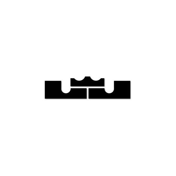
Although the current logo is far simpler, it still has all the necessary elements needed to represent the superstar. Just like the previous logo, the new logo still makes use of the crown that indicates that James is and will remain the king of basketball.
The two halves of the logo below the crown are Bron’s initials “L” and “J”. The negative space in the logo is supposed to resemble the basketball court as well. Clearly, a lot of thought has gone into designing this.
In fact, this logo does not have a particular color scheme either. This gives Nike plenty of room to experiment and get creative with as and when required.
Is the logo popular?
Over the years, as Bron’s career has only seen a rise, his brand has too. Bron is someone who doesn’t even need a logo to attract viewers to his games. His on-the-court performances are enough to convince anybody that he is the GOAT. But the design also has played a big role in the brand’s success over the years.
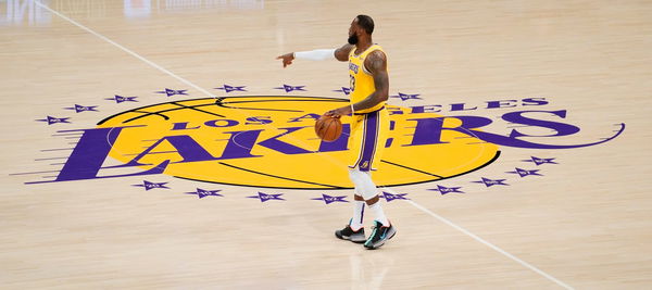
USA Today via Reuters
Feb 20, 2021; Los Angeles, California, USA; Los Angeles Lakers forward LeBron James (23) positions teammates during the seconds quarter against the Miami Heat at Staples Center. Mandatory Credit: Robert Hanashiro-USA TODAY Sports
Bron needed a logo that in a nutshell screamed his personality, and this was it. Since then, his brand has only skyrocketed and will provide him with plenty of security when he retires.
Read also- Why Does LeBron James Wear #23 on His Lakers Jersey?
