New Balance’s Lackluster Shohei Ohtani Reveal Divides Fans, Underwhelming Logo Hides Japanese Phenom’s True Talents

Follow Us

USA Today via Reuters
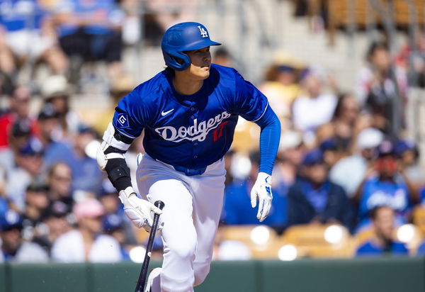
Mar 3, 2024; Phoenix, Arizona, USA; Los Angeles Dodgers designated hitter Shohei Ohtani against the Colorado Rockies during a spring training game at Camelback Ranch-Glendale. Mandatory Credit: Mark J. Rebilas-USA TODAY Sports
Sometimes even the greatest of artists can have a misfire. Shohei Ohtani’s superstardom is growing by the day. The fact that the Los Angeles Dodgers are betting on him to expand in Japan is a testament to Ohtani’s growing influence. His deal with New Balance has further showcased the rising stature of Ohtani around the world. With fans waiting with baited breaths for his signature logo, naturally, the expectations were quite high. Now Shotime has finally released that elusive logo and surprisingly, the fans have mixed opinions on it.
The New Balance logo was made to showcase the unique talent and domination of the two-way phenom. However, fans point out that it focused on the one thing that Ohtani isn’t widely known for – his baserunning. That choice has turned this opportunity of a lifetime to a giant “miss” according to fans.
Shohei Ohtani’s New Balance Logo and growing stardom
ADVERTISEMENT
Article continues below this ad
Last year, Shohei Ohtani signed with New Balance. Finally, after months of waiting, the company has released Ohtani’s Signature Logo. It shows a black-and-white depiction of Ohtani rounding first base. With the company to use it on multiple projects throughout the 2024 season, this is a huge deal for the superstar.
Introducing the Shohei Ohtani Signature Logo from New Balance ⚾️ pic.twitter.com/RPLCeAtm14
— MLB (@MLB) March 19, 2024
Ohtani is headlining the company’s “We Got Now” campaign. According to ESPN, It’s centered around “effortless confidence that comes from those bold enough to embrace the present and the possibility of ‘the now,’ particularly in the more intimate moments – not just on the world’s biggest stages.”
Trending

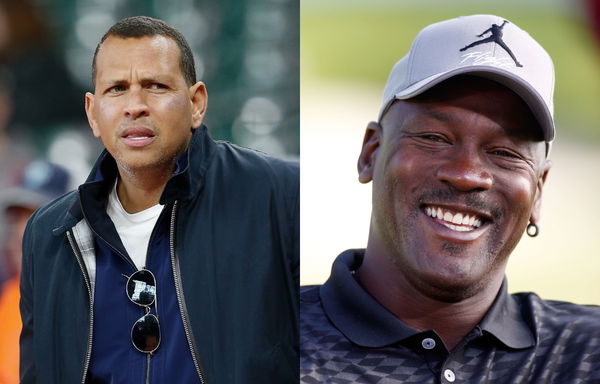
Michael Jordan’s Tobacco Love Turned Alex Rodriguez Into an Addict, Courtesy of a Golf Game Between the Duo
May 07, 2024 02:00 PM EDT

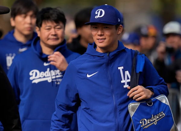
“He’s Terrible”: Dodgers Fans Beg Franchise to Replace Yoshinobu Yamamoto’s Interpreter for Shohei Ohtani’s Interpreter Will Ireton
May 08, 2024 09:30 PM EDT

Who Are Anthony Volpe’s Parents? Everything to Know About His Family of Doctors
March 04, 2024 09:54 AM EST

Dodgers Rub Salt In Angels’ Wounds: Ohtani and Yamamoto’s Presence Bring Cash-Rich Japanese Investors to Blue Side of Los Angeles
May 10, 2024 01:00 PM EDT

Courtside Crush: Nikola Jokic’s Game-Winner Steals the Show From Alex Rodriguez & Jaclyn Cordeiro
May 11, 2024 08:57 PM EDT
Get instantly notified of the hottest MLB stories via Google! Click on Follow Us and Tap the Blue Star.

Follow Us
To commemorate this moment, Ohtani released a statement. “To finally reveal this special logo that I’ve worked closely on is truly an exciting moment for me,” Ohtani shared his gratitude. “It is a visual representation of my journey in baseball and I am excited to share it with the world,” the superstar finished.
However, while the Japanese superstar is quite happy with the end result, his fans are not. The moment the logo was released, it received a highly mixed response from the Ohtani faithful.
“Whatta miss” fans are not enthusiastic about the logo
ADVERTISEMENT
Article continues below this ad
Social media was filled with fans complaining that the logo focused on the wrong thing. One user commented on X, “The only way I would have known this was Ohtani was the caption. In my honest opinion, I don’t think it captures his beyond impressive skill set.”
Another fan echoed the feeling with a simple statement, “Whatta miss.” Then there was one profile that shared how this logo wasn’t quite recognizable. “That could be pretty much any player. In fact, my first thought was Arod. FAIL.”
The absurdity of watching Ohtani running was not lost on fans. “the best hitter and pitcher in mlb history is running?” Finally, there was one fan who noted a major issue in the logo. “not bad but pretty generic and boring.”
ADVERTISEMENT
Article continues below this ad
One wonders what the company will do next. With fans clearly not quite happy with the design, their Shohei Ohtani Signature logo is not really passing with flying colors.
Edited by:

Riya Singhal


