“Might Make Him Reconsider Brands”: Nike Draws Criticism For What It Did Around AJ Dybantsa

Add us on Google
“Might Make Him Reconsider Brands”: Nike Draws Criticism For What It Did Around AJ Dybantsa
Add us on Google
Imago
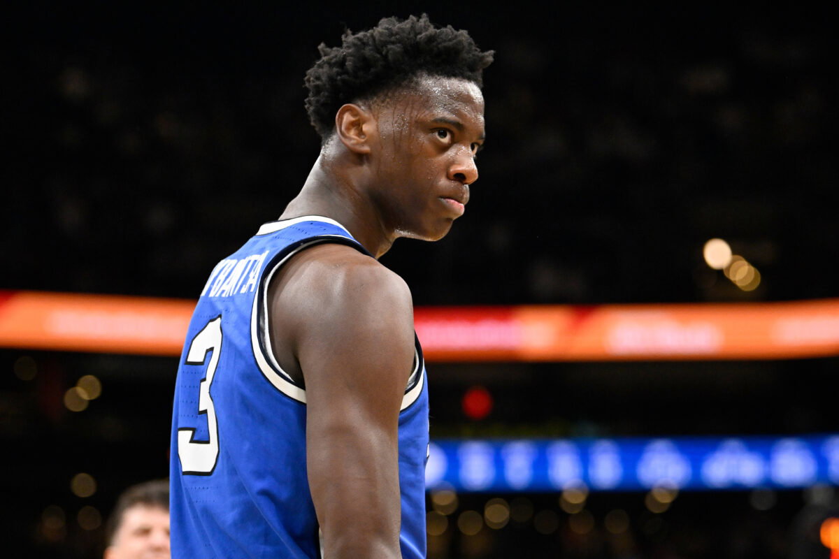
Credit: IMAGO
Imago
Credit: IMAGO
Nike should be celebrating AJ Dybantsa right now, but instead, the brand is catching heat. AJ Dybantsa, who has been a Nike partner for over two years, has officially upgraded his relationship with the brand from a Name, Image, and Likeness deal to a professional multi-year contract. It’s a milestone moment for one of the most hyped prospects in recent basketball history. The reception, however, hasn’t been entirely what Nike might have hoped for.
Watch What’s Trending Now!
At the center of the criticism is the personal logo Nike unveiled alongside the new deal. Dybantsa himself described the design as “abstract art,” explaining that it incorporates his initials “A” and “J”. “It’s some abstract art. It’s like an A and a J. If you keep flipping it, you see it,” he explained. The design itself carries the shape of a star, and Dybantsa connected that to something deeply personal. “I got a nickname when I was younger, ‘Star Boy.’ So, I’ve always been a star. And the pressure doesn’t really faze me. It kind of refines me, like a diamond,” he said.
View this post on Instagram
The sentiment behind it is compelling, but it’s the execution that fans seem to take issue with. And so fans have been far less enthusiastic about what they’re seeing, with the logo drawing widespread criticism online almost immediately after its reveal.
For Nike, AJ Dybantsa has been a priority investment for some time. The brand first signed him to an NIL deal in January 2024 while he was still in high school. And throughout his college tenure he became a regular vehicle for debuting new performance silos, including the Nike G.T. Future. He further cemented his value to the brand with a standout freshman season at BYU, leading the nation in scoring and recording the third-highest scoring average by a freshman in Division I history. By the time his college tenure was over, upgrading the partnership was less a question of if and more a question of when.
With Dybantsa having officially declared for the 2026 NBA Draft, that moment arrived. The professional contract represents a long-term endorsement commitment. And the newly unveiled logo is expected to be a cornerstone of that partnership. The expectation is that it will eventually appear on his on-court footwear, and across a range of Nike-branded performance and lifestyle apparel available to the public, and beyond. The logo, divisive as it may be right now, is clearly positioned as a brand within a brand.
For Dybantsa personally, none of the noise around the design seems to be dimming the significance of the moment. “It means everything,” he said of the upgraded deal. “Nike have been with me since Day 1. It’s been a great partnership and we’re looking forward to keep building for the long term.” Whether fans eventually warm to the logo or not, the partnership itself appears built to last. And if Dybantsa’s trajectory continues the way it has, people may find themselves growing fond of that star sooner than they expect.
Early backlash builds, though time may change how fans see it
Although Nike and AJ Dybantsa himself have framed this new endorsement as the beginning of a long and exciting partnership, one fan, in his view of how bad the logo looked, thinks it might be enough to make Dybantsa reconsider his brand affiliations entirely. “Logo might make him reconsider brands, lol,” he said. Obviously, that may be a stretch. But the reception since the logo’s unveiling was largely unfavorable, and the criticism remained on one consistent complaint: fans simply cannot see the “A” and “J” initials that Nike and Dybantsa insist are in the design.
The comments have been blunt. “There’s literally nothing that says his initials on that logo. It’s sh*t 😂,” one fan wrote. Another was equally unconvinced, saying “Pretending those are an A and a J is just insane.” Nike and Dybantsa have both gone on record to walk fans through the concept, and social media posts have since appeared graphically breaking down the hidden “A,” “J,” and even a “D” for Dybantsa within the design. But for many, the explanation has only made things worse rather than better. As one fan put it rather sarcastically, “I mean I guess if u squint ur eyes,” which for a logo meant to represent a generational talent, is probably not the reaction Nike was aiming for.
For some fans, the need for that explanation was itself the damning verdict. “A logo that has to be explained is a bad logo,” one fan stated flatly. Another went even further, branding it the “Weakest logo in Nike history,” a bold claim, but one that gives a sense of just how poorly the design has landed with a vocal portion of the audience.
In the grand scheme of things, though, what a logo looks like at its unveiling may matter far less than the entity behind it. Negative first reactions to athlete logos and signatures are far from uncommon. In fact, plenty of now-iconic marks met with indifference or ridicule when first revealed. The real test comes over time, and if AJ Dybantsa goes on to become the transcendent NBA star he is very much on track to be, fans will almost certainly find themselves warming to that star design whether they expect to or not.
Logos, after all, tend to look a lot better when the person wearing them is great.
Written by

Edited by

Snigdhaa Jaiswal