What Does The Tokyo Paralympics 2020 Logo Mean?

Follow Us
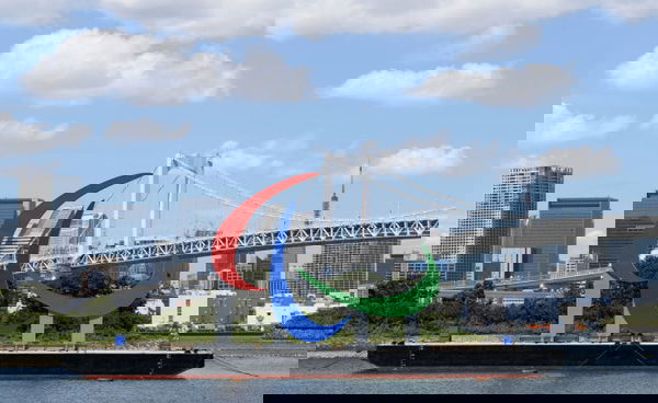
After an exhilarating competition at the Olympics earlier this month, the Paralympics is now all set to dazzle everyone from Tokyo. The competition is going to be intense and cutthroat. In preparation, let’s have a look at the details of the logo for the same.
The Olympic logo has 5 interlocking rings. The colors of blue, yellow, black, green and red on a white flag symbolize the five continents of Europe, Africa, Asia, America, and Oceania. This implies that athletes from all across the world, come together to compete with one another. Moreover, this symbol was originally created in 1913 by Coubertin. However, the Paralympic logo has a different pattern. Here, there are three curved swishes in red, blue and green. Not only this but also, the meaning of the logo is also quite unique.

ADVERTISEMENT
Article continues below this ad
Meaning of the symbol
The International Paralympic Committee (IPC) is making use of Agitos, instead of the Olympic rings. It signifies the four core values of the Paralympics: courage, determination, inspiration and equality. Red, blue and green were chosen for this flag as they are the colors most seen in flags around the world. Furthermore, the curves in the line show ‘spirit in movement’.
Do you know the meaning behind the symbol of the @Paralympics?
The Three Agitos explained (a thread).#TokyoParalympics @Tokyo2020 pic.twitter.com/RdSaLBFGHt
— #TokyoParalympics (@NBCOlympics) August 23, 2021
The word Agitos also has an interesting meaning in Latin. ‘Agitos’ means ‘I move’. Moreover, the name symbolises the motion of the Paralympic athletes. Simultaneously, it also signifies the entirety of the Paralympic movement and the athletes who fly to compete.
ADVERTISEMENT
Article continues below this ad
Trending

Bronny in Deep Waters as $800,000 Suffering Forces LeBron James’ Son to End College Career With Major Declining Numbers
April 27, 2024 01:45 PM EDT

Christopher Bell Trashes Chase Elliott’s “Helpful” Narrative by Condemning NASCAR’s “Useless” Formality
April 28, 2024 08:40 PM EDT

“Trying to Mourn…”: After “Brother’s” Death, Brenden Rice Admits Falling 4 Rounds in the NFL Draft as Chargers Draft Jerry Rice’s Son
April 28, 2024 11:50 AM EDT

Bronny’s Suffering Doesn’t Affect Brother Bryce as LeBron James’ Younger Son Sees Stability Financially
April 28, 2024 02:24 PM EDT

Jerry Jones Trusts Trey Lance to Succeed Dak Prescott as Dallas Cowboys Prepare to Move On From Veteran Stars
April 28, 2024 12:00 PM EDT
Get instantly notified of the hottest stories via Google! Click on Follow Us and Tap the Blue Star.
Follow Us
WATCH STORY- Brock Lesnar, Becky Lynch Return and More: Grand Moments from WWE SummerSlam 2021
Why aren’t the Olympic rings used in the Paralympics?
Fans have a general notion that Olympic events have everything similar. Be it the venue, sports or the number of events. For example, both Games have participants competition in sports like Swimming, Athletics, Basketball, Tennis and so on. However, the logo is most certainly different. Surprisingly, the logos used to be similar back in 2003.
ADVERTISEMENT
Article continues below this ad
Apparently, the primary symbol was based on a Korean tae-geuk decoration. It highlighted blue, black, red, yellow and green symbols. Interestingly, these colors were identical to the colors used at the Olympics. In addition to this, it later was uncovered in Seoul in the year 1988 that it signifies the reality from which all things and values originate. Unfortunately, the design was observed to be very similar to the Olympic rings. Consequently, it was discarded, and the Agitos logo was built. This logo was used for the first time in 2004.
READ ALSO- “For What Shall It Profit a Man”- Anthony Joshua Reflects Sheer Passion Before Oleksandr Usyk Fight
Written by:
