Imago
Credit: IMAGO
Imago
Credit: IMAGO
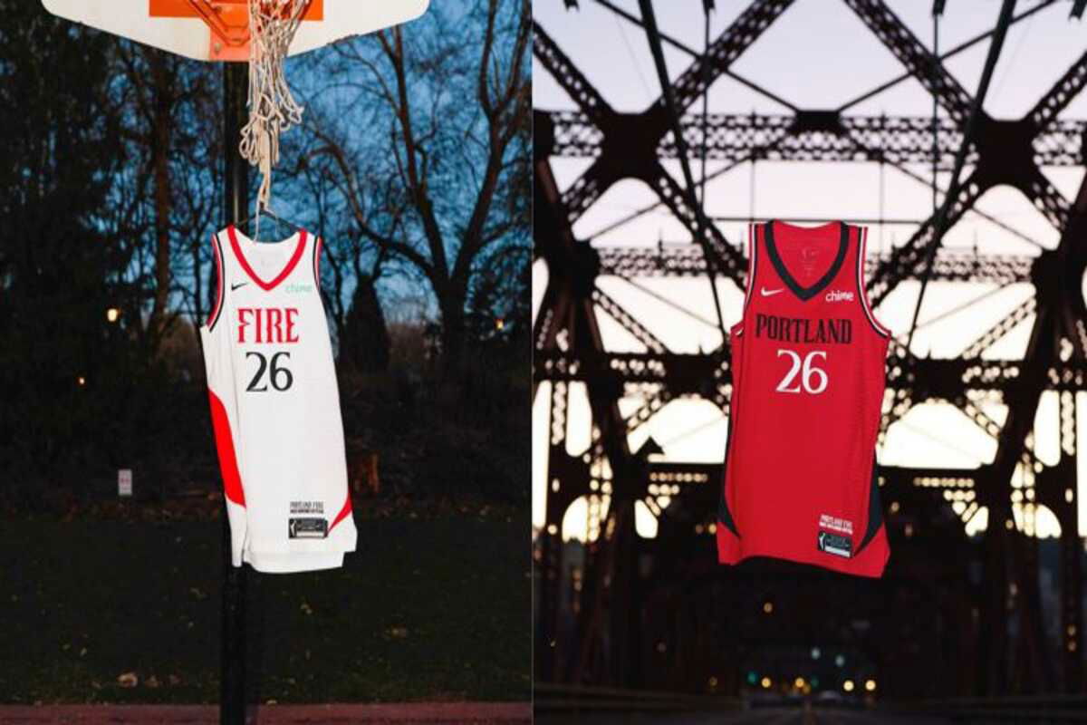
The Portland Fire’s long-awaited return was supposed to begin with a statement. Instead, after the franchise officially unveiled its 2026 Nike-designed white and red jerseys on January 28, fan reaction quickly shifted the focus away from celebration. What was meant to symbolize a new era immediately turned into a debate over whether Portland’s identity actually showed up on the uniform.


Portland Fire’s Senior Vice President of Marketing and Communications, Kimberly Veale, said that the uniforms were a way for the franchise to show who they are and what they want to do. “Our 2026 jerseys are an embodiment of this new era of the team: bold, innovative, and resilient,” Veale said. “Every element was shaped with Portland in mind, honoring our legacy, while capturing the spirit and energy of this incredible city we represent. As we prepare for our debut season in May, our athletes and fans alike will embody that ethos when wearing a Fire jersey.”
Watch What’s Trending Now!
Veale’s focus on design elements that are unique to Portland is part of the franchise’s plan to reconnect with a city that lost its WNBA team years ago. The uniforms have PDX branding on them and side details that are inspired by the Willamette River. The stylized “P” logo is a nod to Mount Hood and the Moda Center. The team is also building the world’s first dual-sport women’s performance center, which will be 100,000 square feet and will house both the Fire and the Portland Thorns of the NWSL. These investments show that RAJ Sports is serious about making Portland a place where women can play basketball.
Many fans were unconvinced by what the Fire unveiled. A lot of people wondered if the jerseys really showed off Portland’s unique style or if they were just basic templates with local symbols on them. Some people liked the white and red color scheme because it felt safe, while others wanted designs that matched Portland’s reputation for being creative. For some fans, the uniforms felt too safe for a city known for its bold ideas.
Portland Fire jersey reveal draws mixed reactions from WNBA community
After social media spoke up, it was clear right away that the franchise’s vision and the fans’ hopes were very different. The organization paid attention to Portland-specific details like the Willamette River-inspired side tape and Mount Hood references. Fans, on the other hand, looked at the jerseys in a different way, comparing them to other WNBA uniforms and wondering if they gave Portland the unique identity it deserves.
“Needs work,” one fan wrote. People were disappointed that the Fire’s first jerseys didn’t make a bigger statement, especially since Portland is what RAJ Sports calls “the global epicenter of women’s sports.” The criticism made it sound like fans wanted something more special to remember the team’s return.
Another supporter had a more positive view, saying the designs were “very modern.” This answer agreed that the clean lines and Nike’s Heroine and Explorer Edition frameworks fit with the look of the WNBA today. The commenter seemed to like that the franchise chose not to use designs that were too busy, even though not everyone liked the minimalist style.
“They’re fine, but a little boring.” “Maybe it will look better with matching shorts,” said another fan, who was in the middle of the road. This measured response admitted that the jerseys weren’t bad, but they didn’t have the visual impact that a team unveiling should have. The mention of pairing with shorts showed that there was hope that the full uniform package would make what looked bad in isolated jersey shots look better.
One user said, “I was really hoping for some identity with someone unique or bright, at least.” This criticism got to the heart of the matter: the jerseys worked fine, but they didn’t create a unique look that set Portland apart from other WNBA teams. This fan’s desire for brighter or more unique elements came from worries about standing out in a crowded league, since the Fire shares red and white with several other teams.
“I think the font is pretty cool!” said another person who liked the design execution. Taken together, the reaction underscored a clear divide. While the Fire emphasized symbolism and restraint in their first reveal, many fans expected a bolder visual statement to mark the franchise’s return. Whether future iterations lean further into Portland’s identity now remains an open question.
In the end, the Portland Fire’s jersey reveal accomplished one thing clearly: it restarted a conversation about identity. The franchise emphasized symbolism, restraint, and long-term vision in its first public step back into the WNBA, while many fans expected a louder visual statement to mark the moment. With the debut season approaching in May, the reaction places early pressure on the Fire to decide whether future iterations lean further into Portland’s creative reputation or continue with a more understated approach.
Written by

Edited by

Ved Vaze