Imago
Mandatory Credits: via NCAA Athletics Wiki – Fandom

Imago
Mandatory Credits: via NCAA Athletics Wiki – Fandom
Now, that’s what you call a smooth start. Joey McGuire’s $400 million Texas Tech Red Raiders are now cruising on full throttle when it comes to the 2025 track on a five-game winning streak. The program before the season pulled curtains had caught a lot of side eyes. The reason? McGuire’s Red Raiders have been one of the highest-paid rosters in college football. They carried a burden of $28 million roster burden on their shoulders. One month down, their gamble can be said to have paid off. But something else left the Texas Tech fans in a tart mood.
Watch What’s Trending Now!
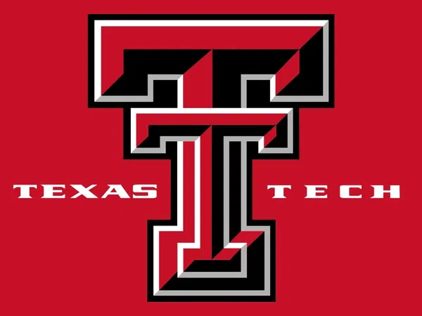
On October 7, the Texas Tech athletic department introduced several new logos. They dropped a teaser on X with the caption, “Rooted in our past, redefined for what’s next. Inside our new brand identity, coming in 2026.” Texas Tech is hitting refresh. Next year, the Red Raiders will trade their metallic shine for a retro “flat T” logo, kicking off a fresh chapter in what looks like a golden era for the program.
After the official announcement, Sports Illustrated made an IG post with the caption, “Thoughts?” Texas Tech rocked a logo similar to the new “flat T” from 1963 to 1999 before switching to a futuristic metallic look for the 2000s. With the classic “flat T,” the Red Raiders racked up 13 bowl appearances and even claimed a women’s basketball national title.
View this post on Instagram
“The clean, flat design of the new Double T logo combines many of the traditional aspects of the Texas Tech’s primary mark with a modernized twist that features proportional design elements and updated colorways,” the Red Raiders said in an athletic department release. As per the reports, the mark will be gradually installed at Texas Tech’s other athletic facilities. The uniforms will have the new logo and implemented in digital applications over the next few months before it is fully launched next spring. So, what are the details that can be seen going by the IG post?
At the top, the classic “flat T” and Raider mascot on the left is being modernized into a slightly bolder “flat T” with a more detailed, black-outlined rider on the right. Below that, the hand gesture graphic is updated from a simple outlined finger-point to a thicker, fully filled design, giving it a cleaner, more contemporary look. Overall, the image highlights subtle modernizations while keeping the retro-inspired feel intact. But somehow, the fans are not happy with the new design.
Texas Tech Red Raiders’ new logo failed to win fans’ hearts
Alongside the Double “T,” Texas Tech teamed up with adidas and Torch Creative to roll out new wordmarks, secondary logos, and sport-specific mascots, full reveal coming soon. But looks like the Red Raiders fans’ patience is already running thin. As an upset fan desperately wants to know,“PLEASE can we bully them into going back?” Talking about facing heat and shutting the haters, McGuire’s program has been a pro at it.
Fans are clearly invested in Texas Tech’s branding, and it’s easy to see why. They’ve long loved the classic, retro feel of the Double “T.” That said, one of them wrote with a crying emoji, “Y does the new one look older😭.” Well, looks like Texas Tech did not redesign the logo on a whim. They conducted a thorough brand audit through LDWW, involving surveys and focus groups with key stakeholders.
Already, the Red Raiders went overboard with paying their players. And now this. A fan came with a harsh reaction, “Seems like a waste of money. 😂” But there went a lot of effort behind Texas Tech’s initiative to revamp the logo. Adidas led the redesign of Texas Tech’s Double “T,” creating three custom fonts, Pumpjack, Techsans, and Matador, drawing inspiration from the school’s football roots, West Texas culture, and Patrick Mahomes II’s “Gladiator” brand.
Now, when we talk about cut-throat rivalry, there exists no recorded rivalry between McGuire’s program and the Temple Owls. But given Temple Tech’s latest logo update, fans draw the two programs together. “Temple copy 🗑️,” wrote one of them. Both programs incorporate red and black heavily in their branding. The Red Raiders’ earlier symbol had a hint of black outline, which has now been replaced with white one, very similar to that of the Owls.
Torch Creative is reimagining Raider Red with a sporty twist. Their beloved mascot is suiting up for every Texas Tech sport, whether he’s tossing a football, sinking a three-pointer, or teeing off on the golf course. But who cares? Not the Texas Tech Red Raiders fans. As one came with a new name after the latest logo drop, “Oh what up Temple Tech?” Time to watch the Red Raiders bring the cheer back to their faithful fans.


