USA Today via Reuters
NWSL: San Diego Wave FC at Portland Thorns FC, Aug 27, 2022 Portland, Oregon, USA San Diego Wave FC forward Alex Morgan 13 reacts during the second half at Providence Park. Mandatory Credit: Craig Mitchelldyer-USA TODAY Sports, 27.08.2022 20:43:38, 18943206, Portland Thorns FC, Providence Park, Alex Morgan, NWSL, San Diego Wave FC, Player, Football player, San Diego Wave NWSL, Kaiser Permanente PUBLICATIONxINxGERxSUIxAUTxONLY Copyright: xCraigxMitchelldyerx 18943206
It’s less than 20 days for the NWSL, and the clubs are gearing up for this year’s bonanza. Gotham FC ran away with the title last season setting the standards for the club. But a new season arrives, and it is a new opportunity for the clubs as the official kits (primary and secondary) have been released.
It will be the first time all 14 teams flaunt a different kit. Most importantly, plain white kits have been discontinued! With the addition of two new clubs, the league is going all aesthetic this season, and the ambition to stand out is visible in Nike. Here, we take a sneak peek at how different clubs’ attire will look in 2024.
NWSL clubs innovating with more local flavor in the kits
ADVERTISEMENT
Article continues below this ad
The clubs will flaunt a more customized approach to their looks this year. The official press release read, “The thoughtful designs reflect each club’s identity, provide a sense of joyful expression, and celebrate the energy created by the sport for the teams and their communities“. By collaborating with Nike, the clubs are showcasing this year’s theme of “the strength of the collective” which features a gradient shift. What sets them apart? Let’s look at some of the interesting ones.
View this post on Instagram
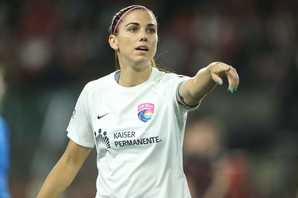
San Diego Wave
Flaunted by Alex Morgan, the Shield winners have gone different from last year’s dark blue kit. In depicting the city’s picturesque sunsets over the ocean, the team has gone with the designs of orange, pink, and blue on a white background. The jersey has its sponsor’s name printed in the center. Apart from that, the club’s name and logo are on the left, and the Nike symbol is on the right, the same as the other clubs.
Trending
Is Kevin De Bruyne Playing Tonight for Manchester City vs West Ham United?

Jurgen Klopp’s Ex Wife: Meet Sabine Klopp, Liverpool Boss’ Spouse Before Divorce in 2001

Ditching Manchester City, Rio Ferdinand Ready to ‘Dry’ Arsenal’s Tears Despite Wanting Mikel Arteta to End Pep Guardiola’s PL Hopes

Pep Guardiola’s Net Worth in 2024: How Much Does the Manchester City Boss Earn From Salary, Endorsements & More

Premier League CEO Breaks Silence on Ditching Pep Guardiola’s Manchester City For Arsenal on the Final Day

View this post on Instagram
2. Washington Spirit
Significantly, the Spirit has gone with the same color this time but added a unique pattern and shade to its look. The face of the club and USWNT’s sensation, Trinity Rodman, showcased her excitement in an Instagram story, revealing the vertical and diagonal shades on its black jersey. The home kit did not show any drastic change, while the away one turned yellow from last year’s white.
3. Orlando Pride
The club has moved from a violet brick pattern to an entirely different design-built wear. The unit from Florida has oranges imprinted on the jersey in a mild color theme with white leaves. It will resemble the city’s fame for the citrus fruit.

4. Angel City
The club from Hollywood town has gone for a similar kit to last year, except for the pattern change with a gray shade on its regular black. The kit reflects the club’s principle of ‘Volemos’ or ‘Let’s Fly.’ The club also released its away kit ‘Sol’ representing positivity and joy.
5. Utah Royals
The nascent club has its bag packed with the Ascent jersey. Inspired by the Rockies and the state’s natural beauty, the club has gone yellow with very subtle patterns of mountains imprinted on them.

6. Racing Louisville
The club from Louisville has won the jersey game this time. Going the argyle way, the club has printed very light lavender and white diamonds on their home jersey. The away jersey is in dark gray with lightly shaded stripes. Horse racing, which is a significant part of Louisville’s culture, inspires the theme.
7. North Carolina Courage
The Charlotte-based team has its new jersey embracing the Triangle region, and the club has replaced its home jersey, which was a transitioning maroon to the dark blue colored jersey, with a blue and red jersey with a shade of triangles in between. Notably, the away jersey is pink with shaded white stripes. The shorts, on the other hand, will hold the word “Be > Seem,” indicating their belief “To be, rather than to seem.”
View this post on Instagram
8. Seattle Reign
Last year’s finalists selected the concept of Reflection this time. With a dark blue jersey and golden border, the club from Washington’s idea was to reminisce about their journey of the past 11 years. The blue indicates its strength, and the gold implies the bright prospect it holds. The club’s away kit uses very meek blue-white to reflect the Pacific Northwest mountains and its affinity to the environment.
9. Portland Thorns
Made in brick red and yellow, the Thorns jersey uses the concept of raising the standard by placing the design of thorny triangles. The deep bond between the club and its fans of Rose City accelerated the decision for a new kit. Their away kit included two shades of dark blue with vertical patterns.
10 KC Current
Kansas City may be reveling with joy after the Super Bowl. But they have an additional reason to rejoice. Even though the club has not made major changes to its color, the details on the kit have been carefully taken care of. Moreover, the jersey involves a red and blue top with darker red patterns on the surface and blue to the sides and edge of the sleeves. The jersey draws inspiration from the Missouri River landscape, reflecting the energetic vibe of the fans and club. The away kit is a mixture of top white to the upper left diagonal in the front and blue to the lower left.
11. NJ/NY Gotham FC
The 2023 Cup winner will portray an influence from New York Skyline for the home kit. The jersey has a black backdrop with patterns of teal. However, the spots are intercepted by a wide black sash representing the Hudson River. The away kit is quite similar to the Seattle Reign, with shades of with and light blue.
12. Houston Dash
Significantly, the Dash will flaunt its primary with orange and away kit in blue. The city took the chance to flex its rich space history via the jerseys. The orange kit emphasizes different colored stars designed on it. Likewise, the collar and the sleeves have a contrasting black finish. The away kit is a combination of light and sky blue similar. The attires will be called the “Space City Blue” kits.
View this post on Instagram
13. Bay FC
ADVERTISEMENT
Article continues below this ad
The rookie team from Boston will kick off with relatively simple clothing. The club released two colored jerseys with black as primary and white as secondary, and both are mostly plain. Looks like the club is not ready to experiment much in its first season.
14. Chicago Red Stars
And lastly, the Chicago Red Stars moved away from black last year to blue. Their primary is made of blue and includes designs of various patterns that may portray the city and its culture. The secondary jersey is plain dark blue, not complicating the design much.
ADVERTISEMENT
Article continues below this ad
Overall, with all the teams excited and about to enter a new era, the jersey could add a distinct flavor. From boosting fan sentiments and engagements to widening the deals, NWSL has re-announced itself in style.
Apart from kits, this year’s NWSL is expected to provide additional experiences with the introduction of VAR and enhanced viewership across the world. In conclusion, the league is ready to explore new horizons. With the innovation in kits, the fans are expected to be rejuvenated with higher levels of energy and excitement.
Written by

Edited by

Jacob Gijy